Showing posts with label LadyUmbrella. Show all posts

Monday, October 4, 2010

The Art of Flyering


If you are looking for a relatively cheap and potentially effective method of promotion for something local I believe flyering is one of the best options out there. This post will discuss the art of flyering and hopefully give you some ideas as to how you can maximise the results of flyering.

Location
It's all about location, location, location when it comes to flyering. You want to be in a place where there is a decent volume of people but also somewhere where you can stop people to talk to them. Also, make sure you are somewhat close to the place you want to coax people into - if you can point to it all the better, don't want people getting lost after they've been "flyered".

Presence
Try have a sign or something beside you to enhance your presence. A small chalk board on the ground which reflects the message you have on your flyers can be very beneficial as when people are approaching you they will be able to get an idea of what you will be handing out flyers for. Also, it makes you look more authoritative and somewhat different to most people handing out flyers if you have a sign beside you.

Pitch
Do NOT just give the flyer to people as they are walking by but give each person a short 10 to 15 second pitch about what the flyer is advertising. Lots of times flyers end up in back pockets (and then washing machines) and have no value at all - use the flyer as an excuse to tell people about your local product or service. To initiate the pitch do something do daze/dazzle or confuse so that you get the passer bys attention..Quickly tell them what the flyer is for and let them know why you are there "I'm handing these flyers out now as there is a huge promotion happening in XYZ and my boss would not be happy if I didn't give one to you!"..Saying something likes this sets the pitch up for the real reason "this promotion is valid only for TODAY" - you want to try get people to take action there and then. Try tailor your pitch to the person as much as possible, pay attention to their body language and responses to your questions/pitch so that you have the best chance of a positive outcome.

Flyer
The flyer you are handing out is first and foremost a prop. It is your wand to dazzle to get passer bys to stop (get creative, a robot dance of some description with flyers gripped in extended arms [I honestly have done this and it works]). The flyer can also be used as a device to keep people talking to you - don't give them the flyer until you give them the full pitch..have the flyer half way towards them and gesture like your giving it to them but don't do so until they have heard the full spiel. Once you give them the flyer you want to make sure that it hammers home the points made in the pitch, ie, mentions the promotion/incentive to take action. Also, make sure to include web addresses and all useful contact info as some people who are interested might not be able to avail of the promotion on that day but might do so at some point down the line.

Hope the above points and ideas have been of some use to you. Any veterans of flyering care to share some of their tips? Have any good flyering stories to tell?


This post was written by Rob from LadyUmbrella ladies t-shirts.

Tuesday, August 3, 2010

Presenting The Graphic T-Shirt


The way you choose to present your graphic t-shirts should be one of the top considerations when you operate an online t-shirt business. Online shops present many advantages - the obvious being that designers can reach consumers from all corners of the world. That connection however is not a tactile one, making our decisions regarding visual presentation all the more important.
 
The online retail market is filled with varying methods of presenting t-shirts. You can enlist fans and/or friends to model your tees (GritFX recently employed some interesting models, as seen on the left), model them yourself (if you're game), photograph your tees on hangers, lay them out flat, or do something all together different. Brands that have strong visual presentation will have three things in common:
1. Relevance - to the brand and the brands' target market.
2. Originality - remember the purple cow? Be Remarkable!
3. Consistency - in style, and in keeping with the philosophy of the brand.

In other words, your presentation needs to ROC it!... (Okay, so I'm trying to coin a phrase here...let me know if it catches on...)
 
When you're brainstorming ideas on how you'll present your t-shirts, remember that customers buying graphic t-shirts will want to not only see the kind of t-shirt they are purchasing - style, cut, colour - they want to see the artwork. Your presentation should cover points 1 to 3 above, together with delivering an accurate representation of the colours and providing clear views of the printed graphics. It's also sometimes a good idea to occasionally do a re-vamp and employ some of the new web design trends - for instance, right now the use of a lightbox plugin for viewing alternate and larger images is popular (something you'll see in the examples below).
 
That's not too much to remember...Is it...?
 
A short design assessment of some of the brands I consider to be on the A-list for visual presentation may assist you in finding your own path to Manz's red carpet...
 
Thriving Ink

Thriving Ink - an independent t-shirt brand - was once a family business that is now run solely by Matthew Dronkers. With new-found freedom, Matt took the opportunity to make some changes and the site was re-branded in June this year! You can read more about that on The Tee Gazette - Promo Alert: Thriving Ink gets relaunched!. 
 
The home page has a slick and linear layout. Customers are presented with a striking, large photograph of a Thriving Ink product, hanging on a slick steel pole - a choice of "hanger" that adds nicely to the polished appeal of the site. The minimal grey background is carried throughout all photography and complements every tee colour in their range. This approach works for the brand and also provides another opportunity to re-iterate the brand! Potential customers can clearly see the Thriving Ink inner t-shirt label, and it's a great way to show individual numbering and any special neck label prints - something original to a brand that showcases shirts which are "designed by real artists from around the world as art for art’s sake". The "front on" view is consistent throughout and when customers are on individual product landing pages, they have the option to view alternate perspectives through the use of a lightbox plugin.

As of the date of this post, you will also see a graphic for the "$15 Grab Bag" - this is a montage of last season's tees shown on a model, clearly illustrating Matt's departure from one form of presentation to another. 
 
**********

Lady Umbrella

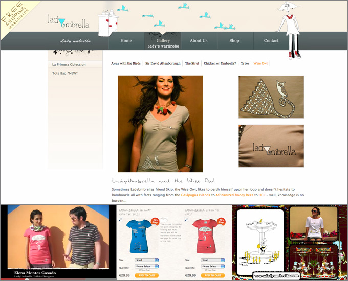
Do I really need to introduce Lady Umbrella to our readers? In case you're a random reader, here is a little background... Lady Umbrella is a range of ladies t-shirts by Spanish designer Elena Montes Casado which was launched upon the world early this year. (Our Irishman Rob is the man behind all the marketing and social media activities for the brand.) They launched with a collection of 6 t-shirts, which are now displayed beautifully on their home page as a slide show of images from their first photoshoot. 
 
Appropriately for their tag line "stay happy", they employed a lovely lady with a beautiful smile to model their tees. Each photo is shot with consistent lighting and a neutral background that's warm, complementary to the t-shirt colours, and shows off shadows nicely - which actually links visually to the shadow work in the t-shirt graphics. Additional photography and views from the same photoshoot are available through their Gallery section. 
 
Once those photographs have your attention, you'll most likely find yourself in the shop section which is designed as a very easy to follow catalogue of the tees. These tee images are void of the model and scripted to load a very decent sized image displaying all the fine details in Elena's work. This feature is provided via the use of a lightbox plugin that is also utilised in the aforementioned gallery.
 
If we exit the main site for a moment, one of the other methods Lady Umbrella is using to present their tees is video. It's important to note that if and when you do a competition draw or the like, try to show off your tees! Lady Umbrella does this nicely using their artist Elena as a model. This concept extends to promotional pieces the brand creates when sharing what's coming to the collection - often decorated by the artist in the same style as the t-shirt artwork.
 
**********

Dos Chicos Tees

Founder of Dos Chicos Tees, Joe Pino, values the quality of art on t-shirts so highly that he enlisted Bryan Vega to bring "Joe's wonderfully witty comedy to life" (to quote the site). This philosophy clearly extends to the unique presentation of design thumbnails in the form of illustrated t-shirts - a simple tee outline acts as a frame for the t-shirt artwork. This minimalist hand-drawn look is also applied to other elements of the site such as photo borders, and complements the drawn "doodle" elements in the brands' logo.
 
Once a design has grabbed you, the product landing page provides a photographed version of the t-shirt - laid out so that the graphic is clearly visible, yet wrinkled enough to emphasize the fabric. More views are also available to customers through the use of a lightbox plugin. This feature presents a clear view of the design artwork plus a larger version of the photographed tee.
 
Dos Chicos Tees presentation doesn't stop there with a section of their website dedicated to "People". Real people in real life situations show off their Dos Chicos Tees. If I may quote the site one final time, these people are "Not paid models, not mannequins, not actors, not dolls." Having someone else say how they love your product can mean more than you shouting it from the rooftops - having a fan photo gallery is a visual incarnation of this idea.
 
**********
 
Detour Designables

Detour Designables is one of the many users of Print-On-Demand (POD) services. Acknowledging the value of your own domain, Juna has set up an appropriate "portal" for his designs. Showcasing over 100 designs, the website presents these as pages of classic round edged thumbnails. The approach is perfect for a large catalogue that continues to grow, as it reduces distractions that may get in the way of browsing, as well as the time required to update.
 
Adding character to the site are header banners and these too are treated with round edges. A mix of models (male & female) and t-shirt styles personalise each category, whilst re-iterating the diversity of tees available and the unisex nature of the range.
 
Once you've chosen a design you like, clicking on the thumbnail will take you outside of the domain to the particular POD system being used to print the shirt.

**********

Looking at what the Print-On-Demand suppliers are doing can also give you a sense of how to apply points 1 to 3. 
Redbubble uses a montage method - combining a background using the tee art, which is then overlayed with an illustrated model. The expressive/artistic approach is perfect for the crowd on Redbubble - they being high on graphic art/illustration. A larger view of the graphic loads on mouse click. Skreened photographs t-shirts laid out on a consistent 'earthy' textured background - a nice touch that supports their ethical "Commitment to Our Earth". A lightbox plugin is used for an enlargement of tees. Zazzle presents their range of t-shirt designs initially as design thumbnails only (and as I write this a Sogeshirts design represents "Funny T-Shirts" on the Home Page!), recognising that customers to the site are initially looking for a design they like rather than a particular product. When on a product landing page, customers can pick to view the design/t-shirt on a catalogue of models. 

 
Left to right: DesignBakery (Redbubble User); Alien's Revenge (Skreened User); and TDjunkie (Zazzle User).


>>> LISTEN TO US DISCUSS THIS POST IN: Podcast 19: Celestial Referrals & Making the Grade


Created By: Amanda Vare "Manz", GritFX, Movies, TV, and Pop Culture Tshirts

Tuesday, March 2, 2010

Rob Ryan - LadyUmbrella


Hello all, Rob here from LadyUmbrella ladies t-shirts and I hope to be a straight talking giver of info. I'm excited to be part of this podcast and as corny as it may sound I want to try help you out if you are starting up your own business..

I'm not a guru, in fact I'm couldn't even pretend to be a guru at Halloween, but I do listen and I will try to help. I hope to field many questions from you all. When I started out in business my mind was constantly buzzing and whirring with ideas and questions and I often thought that if I had someome to bounce them off it would be pretty helpful. So, in short, I'm your wall - bounce your ideas off me and I'll give you my honest thoughts and with a bit of luck help you out somehow.

I'm only a fledgling finding my feet in t-shirt world but I have learned an immense amount of "things" (for want of a better word) that I, despite my business brain saying no, am happy to share with you...just sign up for my 8 week program for only $3999.99....oh the jokes..no, all info here is free, use it, love it and pass it on...

If you happen to read this please leave a comment and say hi..Let me know what questions you have, what topics would you like us to discuss (marketing, branding, SEO, strategy, social media etc) - lay it on me..

Stay happy..
Rob