Thursday, October 21, 2010

Retro Rags


OLD SCHOOLRetro is a culturally aged style, trend, mode or fashion; with the use of "retro" style, icons and imagery being injected into art and media since the industrial revolution.
Those who fondly remember "things past" will respond to retro design because a) they lived through an era, and relate to keywords and recall experiences from a time that is often deemed "the most impressionable time of our lives" - our youth; and b) they have a longing for a particular time or simply find enjoyment and visual pleasure from the themes and/or aesthetics of that time. These comprise the market buying "retro rags" - t-shirts with designs inspired by things past. No matter the point of view of the retro customer, the designer needs the concept to yield a reaction, usually in the form of an aesthetic. Here, aesthetics apply not only to the execution of artwork styles seen in the era, but also any graphic treatments applied to designs with an intent to achieve an aged, worn or vintage look.

This is where I see some strong retro concepts being let down by the finish of the artwork. It's easy to fall into the trap of always using the endless supply of graphic resources online including the use of "worn" fonts - something which I wrote about in my first online guest post for BWI Organic Textures Vs Photoshop Brushes and Grunge Fonts. There are other options, and taking a little more time to work a design could be worth the effort. Within the aforementioned post I outlined a little of my own processes; however for this post I'd like to review 5 tee brands who represent the various ways of achieving a strong retro range of t-shirts.

**********

Mongoware
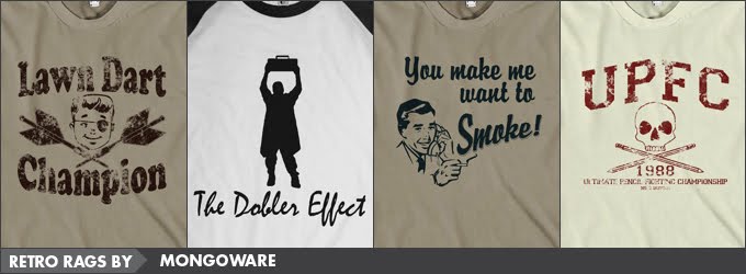
When you browse the Angry Mongo store, it becomes clear that the mind is one of a Generation-Xer. The 80s is a popular retro era that I personally respond to, but that's not why I chose Mongoware to feature. Here we have an example of a designer with a large range of designs with varying styles. All achieve the same nostalgic reaction from me which shows how mixing up your style doesn't hurt and can in fact help you hit the mark. The vintage version of Lawn Dart Champion represents a great balance of concept, use of retro imagery, and a vintage aesthetic which Mike (Angry Mongo himself) achieves using a digital process in Paint.Net - its uneven finish nicely imitates a worn print. The Dobler Effect is a modern, minimal silhouette of a pop culture reference that only a discerning fan of 80's movies would recognise - which is often part of the appeal of a design inspired by things past. There are many other great designs to check out on the Mongoware store, and the scope goes beyond the 80s (sometimes borrowing a style of the past for a modern pop culture reference as seen with You Make Me Want To Smoke).

Mongoware
Left to Right: Lawn Dart Champion; The Dobler Effect; You Make Me Want to Smoke; and Ultimate Pencil Fighting Championship.

Follow Mongo on Twitter * Join Mongo on Facebook

***************

Cathie Tranent
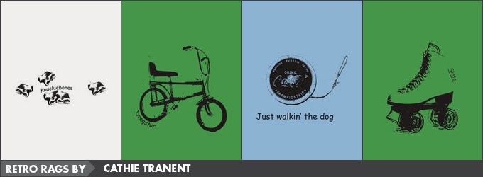
To use or to not use photography on t-shirts...? This can be a passionate debate, and for me the Remember When? retro range by Cathie is affirmation that, yes, photography can be great on t-shirts. The high contrast style is reminiscent of results achieved when using an old photocopier, reproducing a photographic image so that midtones are lost. With these midtones and background stripped out, the focus is on the iconic objects which Cathie has accompanied with simple text. The balance creates a nice hierarchy and the eye only see's the text after they've taken in and reacted to the image. In the case of Yo-yo, the trend is broken in order to create a base in which "the dog is walked". Once again, this demonstrates that some consideration of alternating your layout or style can be beneficial. The high contrast effect also reminds me of the look achieved by Andy Warhol when enlarging photographs and transferring the images onto his canvases using a projector (sans the bright colours).

Cathie Tranent
Left to Right: Knucklebones; Dragstar; Yo-yo; and Skate.

Follow Cathie on Twitter * Join Cathie on Facebook

*****

Instant Classic Tees
Scott of Instant Classic Tees recognises that when emulating a vintage style there is value in using organic processes in conjunction with the use of computer tools. One of the many qualities that I derive pleasure from in this collection is the use of hand drawn graphics & text which connect nicely to pre-computer aesthetics. The hand drawn lettering is reminiscent of vintage poster art and similar to results you'd see when using Letraset (where edges would break away leaving an uneven effect). When a computer font is used, the selection is appropriate for the era and then given more of Scott's aging treatments - for as Scott tells it, "I love most things vintage, retro, worn, and distressed because they have a story to tell." The use of scanned textures (e.g., worn book covers & abrasion) applied to the designs in Photoshop give a natural finish - helping you believe the tee has a history. While speaking with Scott about his processes, he also recommended another useful tool he employs - Mister Retro Machine Wash filters. And if we're lucky, there may be a more comprehensive post by Scott about his processes in the future.

Instant Classic Tees
Left to Right: en Francais; I'm a NERD; I Learned the Shuffle; and 1981 Euchre Champions.

Follow Instant Classic Tees on Twitter * Join Classic Tees on Facebook

***************

Glennz Tees
Glennz Tees represents how retro themes and concepts are just as effective in achieving a nostalgic reaction, without the need to borrow from any specific retro design style or aesthetic. Granted, it's rare that you see this done so successfully, and it is testament to Glen's unique style and his ability to mix the retro pop culture references with humor that they work so well. The vector art is current, modern and clean; with the execution resulting in a timeless aesthetic. This enables Glen to tackle concepts which incorporate themes that run the gamut of "retro"; from back in the 18th century - with the design Extreme Beginnings - through to the 20th century, such as the 50s (with Luna Studio) and of course a number of great designs for the beloved 1980s (including Stuck in the Past). While the design style is not a reflection of the era, nor treated to look aged, the illustrations clearly connect with their pop culture reference and the iconic link is crystal clear. These designs need no text as the messages are embedded in the clever imagery. It's this quality of graphic art and "visual communication" of things past that the tee lover falls for.

Glennz Tees
Left to Right: Extreme Beginnings; Lunar Studio; Stuck in the Past; and Cooler.

Follow Glennz Tees on Twitter * Join Glennz Tees on Facebook

***************

8 Ball Tees
Amongst the massive tee range by 8 Ball Tees, you'll find an 80s fashion category, a retro category plus a category 8 Ball Tees have called "vintage". The latter is the range I'd like to focus on in this post as it represents another way to achieve an amazing retro range. Not only are some of the designs treated to appear distressed, the t-shirts themselves have been produced using a washing technique developed to give a worn vintage look. This process, along with reduced ink screen prints, means that "Each t-shirt will have its own unique character, and no two tees will be the same". Combining this extra step in production with designs styled for the era is extremely effective and I find myself nostalgic for some of my old tees that have sadly been laid to rest. Anarchy Symbol has an organic spray paint quality and is distressed for extra effect; whereas Boombox has been printed with a gold glitter effect transfer - a nice way to add another 80s reference. Excellence is not exclusive to production; the thoughtful consideration of the Pong score on Pong 1972 - that being the year Pong first appeared - adds another clever dimension to the tee.

8 Ball Tees
Left to Right: Anarchy Symbol; Boombox; 69 Vintage; and Pong 1972.

Follow 8 Ball Tees on Twitter * Join 8 Ball Tees on Facebook

***************

Created By: Amanda Vare "Manz", GritFX, Movies, TV, and Pop Culture Tshirts


I can't close this post without a nod to one of my favorite 80's movies - which inspired one of the designs seen above.

I gave her my heart... she gave me a pen...


2 comments:

  1. Great post, Manz - finally got a chance to read it! You've got some great designs showcased here!!

    ReplyDelete
  2. No love for the retrofort at zazzle. Now I'm sad.

    ReplyDelete