Game Demo Slot Online Yang Lagi Viral
4 years ago

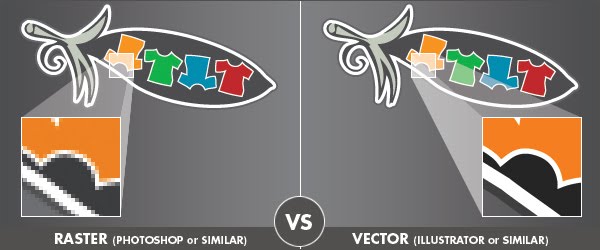
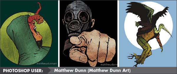
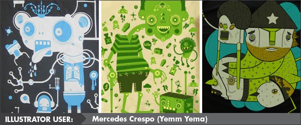
 For me, when it comes to t-shirt design, the process currently entails the use of Illustrator and Photoshop hand in hand... if only I could find a way to apply that to my use of Twitter and Facebook! Artwork requirements for me at present do not require colour separations - direct-to-press is usually an output of a digital png file. However, should my path take a turn for independence (which is the ultimate agenda), then those files will need clear colour separations. Thinking ahead, I try to set up each file in anticipation for that day.


Bookmark this post:blogger tutorials
Social Bookmarking Blogger Widget |
Cool post! I love both Photoshop and Illustrator. I usually do a rough sketch, recreate it in Illustrator, then texturize it in Photoshop. If I had to pick one favorite though it would be Illustrator.
ReplyDeleteCheers Scott! It would appear we are much alike :)
ReplyDeleteI also admire how you've applied the aesthetic that your methods produce to branding - your site background graphic looks terrific!
I'm lame. I use Paint.Net. heehee.
ReplyDeleteI have CS4 lying around but never bothered to install it on my computer yet.
I am a heavy user of the straight line / curved line tool for drawing and then effects and plugins to achieve the desired look I want. Sometimes it takes minutes, sometimes hours.
It's funny how people are sort of "Mac vs PC" when it comes to Photoshop vs. Illustrator, lol.
ReplyDeleteI started out with Photoshop using version 3 - let's not say how long ago that was, lol.
I prefer Photoshop probably because I'm so much more comfortable with it but wouldn't it be nice if it was vector. . . .
Never got into illustrator that much though I have it installed.
I do my work in a variety of ways - all digital, pencil or pen sketch scanned and colored in photoshop. I even use Corel Painting for some things. Whatever floats the artistic boat!
Thanks Manz!
ReplyDeleteI love the vintage/retro aesthetic and it's fun incorporating that into my brand.
@ Mongo - Not lame at all when you use what's working for you. I'd even use letraset and scan it if I wanted a certain look with type. Nothing is lame. If I was quizzed on your designs, I would have thought something like The Dobler Effect could have been done as vector... just shows how PaintNet can produce a similar finish.
ReplyDelete@ Pop Art Diva - The debate on Mac vs PC could be a post in itself... but one I couldn't admin... too bias on that point. Always been a Mac girl myself for design work. However, to give the PC some credit, it is used more for internet browsing. I think you're like Mongo - many of your designs could easily be seen as vector artwork. If some free time ever opens up you may grow to love Illustrator! I know it took me some time to warm to it.
@ Scott - np! You nail the vintage/retro look - It's one of those design aesthetics that I find tricky to define with words - almost minimalist... sensitive to the era and graphic processes - when you see it done right, it looks terrific!
Thanks for sharing everyone!!
Hey Amanda...a real interesting comparison you have come up with and I liked the way you made it specific for the tee ring. And also, I really liked the way T-shirts are scattered all around on this blog. Will try visiting it more often :)
ReplyDeleteThis comment has been removed by a blog administrator.
ReplyDelete