Showing posts with label Illustrator. Show all posts

Tuesday, June 15, 2010

Photoshop VS Illustrator In The Tee Ring


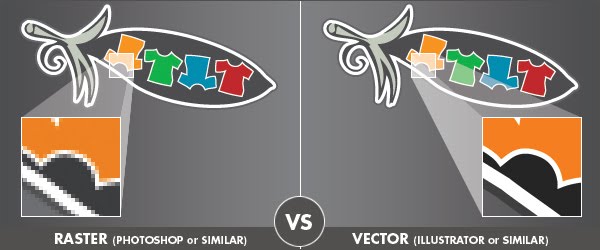
Raster images are composed of connected dots (pixels) and vectors are images composed of connected lines. Each pixel is a tiny square, whereas vector images are defined by math, not pixels. Vectors can be scaled up or down without any loss of quality.

Raster Art VS Vector Art - Graphic Diagram Illustrating the Differences

Photoshop (raster art) and Illustrator (vector art) are both used by designers when creating t-shirt designs. Each have their value in the design world and designers have various reasons for their use. I personally cringe anytime I hear a senior designer tell a junior that "this is the way you do it", which is often the way that certain designer has chosen to do it. Design, as per any form of creativity, can and should involve the individual's touch, and that means allowing a designer to develop their own methods for achieving the style they wish to express in any given concept.
 
That doesn't mean that there aren't very valid reasons for the use of each. By listening to the point of view of your peers, you can learn from their experiences and points of view which can inspire your own methodologies.
 
Namaste Tee Design by GritFX T-ShirtsFor me, when it comes to t-shirt design, the process currently entails the use of Illustrator and Photoshop hand in hand... if only I could find a way to apply that to my use of Twitter and Facebook! Artwork requirements for me at present do not require colour separations - direct-to-press is usually an output of a digital png file. However, should my path take a turn for independence (which is the ultimate agenda), then those files will need clear colour separations. Thinking ahead, I try to set up each file in anticipation for that day.
 
The majority of my initial design and typography is created in Illustrator. On the occasions that we (GritFX) decide a design is suited to some "grit" (aka: a GritFX worn texture look), my final layouts are saved out as layered Photoshop files where I can then apply my chosen scanned texture as Photoshop masks. One could convert these into vector also, however I like to keep the natural gradients - the subtleties that the scan picks up - converting to vector would remove this. I consider Illustrator the superior program when creating effects with typography along with achieving geometry with greater ease.
 
I have all layouts backed up as vector artwork which gives me the flexibility to scale up a design for a larger t-shirt screen. When the day comes for us to go to the screen printers, the work involved is minimal - I may need to re-apply textures, but I'm not going to have to go back to the drawing board. If I decided no scaling is required, then my finished Photoshop files with final textures are set-up with layers, and colours can be separated from that file.
 
With my overview now out of the way, let's hear from some of our peers. The following were selected as I evaluated each as being strong representations of the use of each program, and how both have assets. Each designer was kind enough to chat with me and contribute to this post with their thoughts on why they work with what they do.


In the Photoshop corner...
(raster art examples)


1. Olga Shvartsur - Olechka Art + Design

Olga Shvartsur - Olechka Art + Design
"I sketch the drawing on smooth bristol paper, usually 11x14 inches, using graphite pencils, ranging from HB to 9B. Then I scan the drawing and open the file in photoshop CS 3 (I am on a Mac). After cleaning up smudges (using the dodge tool) and adjusting levels/contrast, I use a photoshop action which converts my black/white drawing into a transparrent image. Then, I use photoshop brushes to add color and effects (such as splatters, watercolors, etc) to my graphite drawing. Using multiple layers helps me achieve the desired effects.

I love photoshop because it makes my traditional drawings very versatile where I can add various effects and experiment with different techniques (and I LOVE the "un-do" option, which you don't always have in traditional drawing)."


Follow Olechka Art on Twitter * Join Olechka Art on Facebook

*****

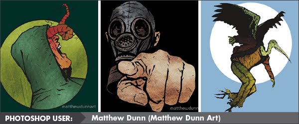
2. Matthew Dunn - Matthew Dunn Art

Matthew Dunn Art - Comic creator/Illustrator
"I mostly use Photoshop as it's the program I've worked with the most/longest so have a much stronger understanding of it (I'm still getting to know Illustrator and currently don't find it as flexible as PS). I do all my illustrations freehand then scan them in and build onto it in Photoshop, often adding different layers that I've also painted and scanned. The only filters I use in PS are the Halftones (I can't get enough of the old/rough comic book feel they provide, plus it's getting harder and harder to find sheets of halftone paper to manually stick down onto original art)."

Follow Matthew Dunn Art on Twitter * Join Matthew Dunn Art on Facebook
 
**********
 

In the Illustrator corner...
(vector art examples)


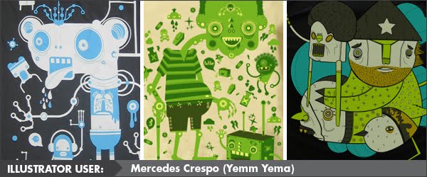
1. Mercedes Crespo - Yema Yema

Yema Yema
"I am a sucker for vectors! Love the sharpness and cleanliness. Also color feels brighter and fresh! Vectors are like fresh candy! I really just sketch and draw from my sketch, hardly never scan. Start by playing with circles and squares to create a nice composition. I have been told by friends, that I don't use the program to the fullest, what I tell them is that I use the program to to fit me and my art. If I ever need to learn a new technique, I just jump to a tutorial. But bottom line it's really not about what program is better, but what works best for the artist, and for me illustrator is my canvas."

Follow Yema Yema on Twitter * Visit the Yema Yema Emptees profile

*****

2. Peachanan Rojwongsuriya - The Peach Apparel

The Peach Apparel
"Basically I sketch on paper and scan. Then trace the image purely in illustrator. Vector is actually the reason why I use it. My artwork can be scaled up or down every time I want. Also, the file size is lesser compared to Photoshop. The result also looks cleaner as well."

Follow Peachanan on Twitter * Join Peachanan on Facebook

*****

Over to you the reader... what methods do you adopt when creating artwork for your t-shirts? Leave a comment with a link!


>>> LISTEN TO US DISCUSS THIS POST IN: Podcast 10: A Good Year to Succeed!


Created By: Amanda Vare "Manz", GritFX - Movies, TV, and Pop Culture T-Shirts